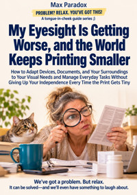
My Eyesight Is Getting Worse, and the World Keeps Printing Smaller - How to Adapt Devices, Documents, and Your Surroundings to Your Visual Needs and Manage Everyday Tasks Without Giving Up Your Independence Every Time the Print Gets Tiny ebook
Max Paradox
29,99 zł
19,90 zł
Najniższa cena z 30 dni przed obniżką: 29,99 zł
19,90 zł
Najniższa cena z 30 dni przed obniżką: 29,99 zł
Dowiedz się więcej.
- Wydawca: ALL-IN Rafał Płonkowski
- Kategoria: Poradniki•Zdrowie
- Język: angielski
Your eyesight is changing. Apparently, the rest of the world has responded by making everything smaller.
The instructions on your new appliance look like classified information. Your phone has a hundred clever features, but the button you need is hiding somewhere behind three mysterious icons. A website proudly announces that it has improved accessibility, then asks you to identify a traffic light in nine microscopic photographs.
And don't even mention the small print on official documents. Apparently, important information becomes more professional when nobody can read it.
If any of this sounds familiar, Max Paradox has written a book for you.
My Eyesight Is Getting Worse, and the World Keeps Printing Smaller is a practical, funny and reassuringly sensible guide to making everyday life more manageable when visual information becomes harder to access.
Rather than expecting you to concentrate harder, squint longer or buy every magnifying gadget advertised on the internet, this book helps you understand which obstacles can be changed, which tools are genuinely useful and when a different approach makes more sense.
You'll discover how to make smartphones and computers more comfortable to use, adjust text and display settings, explore magnification and spoken-reading features, and recognize the limitations of automatic text recognition. You'll also learn how to work with printed documents, navigate complicated forms, check consequential information and avoid turning every important number into an educated guess.
But life happens beyond screens.
The book explores practical ways to organize your home, improve access to everyday controls, deal with confusing packaging, shop more confidently and navigate unfamiliar places. It shows how to ask for readable information without handing other people control of your decisions, and how to make arrangements that remain useful when devices change, websites are redesigned or something stops working at exactly the wrong moment.
There is room for reality, too. Not every solution is affordable. Not every visual difficulty can be solved by larger letters. Some situations require professional eye care, specialist rehabilitation or assistance from another person. The book explains why acknowledging those limits is compatible with independence, and why important information should never be guessed when health, safety or finances are involved.
Written with sharp observational humor and grounded advice, this is not a collection of inspirational speeches about overcoming everything through determination. It is about understanding the actual problem, reducing unnecessary effort and keeping control over the activities that matter to you.
Because independence doesn't mean refusing help, mastering every device or proving you can read the smallest label in the room.
It means having reliable ways to understand information, make decisions and participate in your own life.
The world may keep printing smaller. You don't have to keep making your life smaller to accommodate it.
This publication was prepared using tools that support the creative process, including artificial intelligence solutions. The final concept, structure and editing are the responsibility of the author.
Ebooka przeczytasz w aplikacjach Legimi lub dowolnej aplikacji obsługującej format:
Liczba stron: 243
Rok wydania: 2026
Podobne



















Cover
My Eyesight Is Getting Worse, and the World Keeps Printing Smaller
How to Adapt Devices, Documents, and Your Surroundings to Your Visual Needs and Manage Everyday Tasks Without Giving Up Your Independence Every Time the Print Gets Tiny
Max Paradox
PROBLEM? RELAX. YOU'VE GOT THIS!
ISBN: 9788384838549
ALL-IN Rafał Płonkowski
Table of contents
Title page
INTRO
Chapter 1 - When Your Eyes Stop Following the Old Rules
Chapter 2 - Why Bigger Print Doesn't Always Make Things Easier
Chapter 3 - The Dangerous Confidence of a Good Guess
Chapter 4 - The Magnificent Magnifier That Solved Absolutely Nothing
Chapter 5 - The Great Disappearing Act: When Your Own Home Hides Everything
Chapter 6 - The Hidden Cost of Trying Harder
Chapter 7 - The Website That Wants Proof You Are Human
Chapter 8 - Speak Up, Not Louder: Asking for Information You Can Actually Use
Chapter 9 - Your Smartphone Has Accessibility Features. It Would Be Nice If You Could Find Them
Chapter 10 - The Computer Is Powerful. The Text Shouldn't Need a Microscope
Chapter 11 - Paperwork Without the Squinting Championship
Chapter 12 - A Home You Can Navigate Without Playing Twenty Questions
Chapter 13 - The City in Fine Print: Getting There Without an Expedition
Chapter 14 - Shopping Without Playing Guess the Price
Chapter 15 - When Bigger Stops Being Better: The Limits of Ordinary Solutions
Chapter 16 - Everything Worked Yesterday: Independence When the System Breaks
Chapter 17 - You Don't Have to Win Every Battle with the Small Print
Chapter 18 - Keeping Things Accessible When Life Keeps Rearranging Them
Chapter 19 - The Warning Signs That Your World Is Getting Smaller Again
Chapter 20 - Life on Your Terms, Even If the Font Has Other Plans
Landmarks
Cover
Title page
Table of contents
Start of content
INTRO
The letter from your internet provider begins with wonderful news. The company is committed to making your life simpler. This announcement occupies nearly a third of the page, printed in enormous, cheerful letters beside a photograph of someone looking suspiciously delighted about broadband. Unfortunately, the actual changes to your monthly bill are explained in a patch of pale gray text near the bottom. You hold the letter closer, then farther away, then directly beneath the kitchen light. Eventually, you discover that the price is increasing, although the exact amount remains a mystery. Apparently, making life simpler begins by ensuring customers cannot read the complications.
If this sounds familiar, you have probably noticed that everyday life contains an astonishing number of things you are expected to read. Instructions, payment terminals, appointment reminders, appliance controls, product descriptions, digital forms and messages from organizations that seem convinced a smaller font demonstrates greater professionalism. None of these tasks looks especially demanding on its own. Yet when your eyesight makes details harder to distinguish, a perfectly ordinary day can become an obstacle course of tiny decisions. You spend additional time identifying information, checking whether you understood it correctly and finding ways around poorly designed materials. The frustration is not always dramatic. Sometimes it is simply the accumulated exhaustion of having to work harder at things nobody else notices.
There is an important distinction worth making immediately: difficulty seeing something does not necessarily mean the entire problem lies with your eyes. Vision can change for many reasons, and those changes deserve appropriate professional assessment. But the information itself may also be unnecessarily difficult to use. Thin lettering, poor contrast, reflective surfaces, cluttered layouts and badly positioned screens can make ordinary tasks harder. A person who reads comfortably in one setting may struggle with the same information presented differently. The world has developed extraordinary technology for displaying information, yet occasionally seems determined to use it for arranging light-gray lettering on slightly lighter-gray backgrounds. One wonders whether the designers receive bonuses for every customer who squints.
What makes worsening eyesight particularly frustrating is the effect it can have on independence. You may begin asking someone else to check an unfamiliar screen, explain a notice or confirm a detail you would once have handled without thinking. There is nothing wrong with asking for help. Human civilization would collapse remarkably quickly if everybody insisted on doing absolutely everything alone. The difficulty comes when assistance stops being a choice. You might avoid an unfamiliar service because the sign-up process is uncomfortable, postpone dealing with paperwork or depend on somebody else's interpretation of information that affects your decisions. Gradually, your world can become smaller even when your ambitions have not changed.
The conventional advice is not always particularly useful. Someone suggests buying stronger reading glasses, downloading a magnifier app or turning up the brightness. Any of these may help in the right circumstances, but none solves every visual difficulty. Enlarging an entire screen can leave you seeing only a tiny portion of its contents. More brightness may increase uncomfortable glare. A magnifier that works beautifully for examining a single word might be awkward for reading several pages. And the world's most sophisticated accessibility software is rather less impressive when its main settings are hidden behind an unlabeled button. Before choosing a solution, you need to understand what makes the particular task difficult.
That understanding does not replace medical care. Changes in vision can have different causes, and a qualified eye-care professional can assess whether correction, treatment or further investigation is appropriate. Sudden vision loss, sudden significant changes, new flashes or numerous floaters, a shadow or curtain across your vision, or severe eye pain require urgent medical attention. This book will not diagnose conditions, prescribe treatment or promise that clever household adjustments can reverse an underlying eye problem. Its purpose is different: to help you make everyday activities more accessible while recognizing when professional assistance is necessary. A better reading lamp can be useful. It is not a substitute for an eye examination, however enthusiastically its packaging describes the technology.
The practical approach begins with the activity rather than the gadget. Suppose you are struggling to manage important correspondence. The real objective is not to become exceptionally talented at deciphering difficult print. It is to understand what the correspondence says, identify anything requiring action and respond accurately. Depending on the material, that might involve obtaining an accessible electronic version, using suitable reading software or changing the way information is presented. Another task may call for a different solution entirely. The question becomes: What am I trying to accomplish, what prevents me from doing it comfortably, and what would a successful result look like? Those questions are more useful than browsing expensive equipment with a vague hope that something will perform a miracle.
Technology will play an important role, but it will not be treated as magic. Phones and computers offer valuable accessibility features, including adjustments to text, display settings, magnification and spoken information. Scanning and text-recognition tools can open up material that would otherwise be difficult to read. Yet these systems have limits. Automatic recognition can make mistakes, interfaces change, batteries run out and not every application handles accessibility well. Cost matters, too. A solution requiring an expensive subscription or a new device every year may be unsuitable even if it looks excellent in a demonstration. We will focus on how to judge usefulness in real circumstances, including those involving limited time, money or patience.
Physical surroundings matter just as much. A home that looks beautifully organized may still be inconvenient if controls are difficult to distinguish or everyday objects are positioned awkwardly. Public spaces can present different challenges, particularly when information must be found quickly or movement involves safety risks. Documents bring their own complications: a file may be technically digital while remaining practically unreadable. And people, despite generally being more adaptable than machines, do not always understand what assistance would actually help. Learning to request a usable format or a clear explanation can be as valuable as purchasing another piece of equipment.
One principle will guide everything: independence is about retaining meaningful control, not proving that you can perform every physical action without assistance. You may decide for yourself while asking someone to read an inaccessible instruction. You may choose an alternative method of completing a task instead of struggling with the method traditionally expected. You may also decide that a particular activity requires professional support or cannot safely be performed under present conditions. These are not contradictory approaches. They reflect sensible choices based on circumstances. There is no special prize for taking forty minutes to complete something unnecessarily difficult when a safe, accessible approach would accomplish the same goal.
For now, begin with a modest observation. The next time an everyday activity becomes visually uncomfortable, notice precisely where the difficulty occurs. Is the information genuinely too small, or is it hard to locate? Do reflections interfere? Can you recognize the individual symbols but lose track of their relationship? Is the task only troublesome when you feel rushed? Consider how often it happens and whether an error could have serious consequences. You do not have to purchase anything or overhaul your routine. Identifying one recurring obstacle accurately is already more productive than collecting several attractive solutions to a problem nobody has clearly defined.
This book will not turn every label into a billboard, persuade every company to abandon decorative microscopic lettering or guarantee that technology will always cooperate. Some obstacles will require compromises, some will need specialist advice, and others may remain frustrating. But you can develop better ways to recognize problems, evaluate solutions, access important information and protect your freedom to make everyday decisions. The aim is to spend less of your life negotiating with unreadable interfaces and more of it doing whatever those interfaces were supposed to help you accomplish.
After all, you have better things to do than conduct a personal investigation every time somebody prints a sentence. You deserve information you can use, tools that work for you and choices that remain yours. If the world insists on making everything smaller, it does not follow that your independence must shrink along with it. And perhaps the next time a company announces that it has made your experience simpler, you will be able to read the actual details before congratulating it.
Chapter 1 - When Your Eyes Stop Following the Old Rules
The first clue arrives at a garden center. You are buying a small plant for your kitchen windowsill, and the care label promises to explain everything you need to know. Unfortunately, the instructions are printed on a tag approximately the size of a postage stamp, complete with tiny symbols that might represent sunlight, water, or an ancient civilization's agricultural calendar. You turn the tag over, bring it closer, move it farther away, and eventually decide the plant probably wants some water and a reasonably cheerful location. Three weeks later, its leaves are turning yellow. You still cannot tell whether you have watered it too much, too little, or offended it personally.
The incident is easy to dismiss. After all, difficult labels have been frustrating people for years. But then you notice similar problems elsewhere. Reading a name on a noticeboard requires another look. Recognizing someone across a room takes longer than it used to. Finding a particular object among several similar ones becomes unexpectedly demanding. None of these moments necessarily seems important enough to mention, yet together they suggest that familiar activities are becoming less straightforward. You may respond by concentrating harder, changing your position, or pretending that the information was never particularly important. These strategies can work temporarily, which is precisely why the underlying difficulty may remain unnoticed for so long.
One useful distinction can change how you approach the problem: being able to see something is not the same as being able to use the information it contains. You might recognize that a noticeboard contains several announcements without being able to identify the one you need. You might see the outline of a person without recognizing their face. You might distinguish every item on a shelf but still struggle to locate one particular object quickly. Vision supports several different activities, and the requirements change depending on what you are trying to accomplish. A single description such as "my eyesight is getting worse" may accurately express your frustration, but it offers little guidance about which everyday adjustments could help.
Consider three ordinary situations. In the first, you cannot comfortably read a magazine held at your usual distance. In the second, you can read the same magazine but find it difficult to follow the text when the page is crowded with photographs and advertisements. In the third, the magazine is perfectly readable at home but uncomfortable under the harsh lighting of a waiting room. All three situations involve visual difficulty, yet the practical obstacles are different. The first may warrant assessment of your near vision and appropriate correction. The second may relate to how information is arranged. The third raises questions about lighting and glare. Treating them as identical problems would be rather like responding to every unusual noise in a car by buying a louder radio.
What exactly has become difficult?
Visual acuity, which relates to distinguishing fine details, is only one aspect of functional vision. Contrast sensitivity, visual fields, light sensitivity and other visual functions can influence how comfortably you perform everyday activities. Different eye conditions and individual circumstances may affect these abilities in different ways. This is why two people who describe themselves as having poor eyesight may need very different solutions. One may benefit from larger print, while another finds that changing the presentation or position of information is more useful. You do not need to identify the medical cause yourself. That is a job for an appropriately qualified professional. You can, however, describe the practical difficulties you experience.
Distance is an especially revealing detail. Ask yourself whether the difficulty occurs primarily with nearby objects, things farther away, or both. Perhaps reading an ordinary book remains comfortable, while recognizing signs across a large room has become harder. Maybe you can see distant landmarks clearly but struggle to focus on a small object in your hands. Some people instinctively move objects closer; others extend their arms until reading begins to resemble an exercise in upper-body flexibility. Such observations are useful when discussing your vision with an eye-care professional. They also help you avoid purchasing equipment intended for a different task.
Timing matters, too. A particular activity may feel manageable when you are rested and more demanding after sustained visual work. Conditions such as lighting, screen reflections and the nature of the task can affect comfort. Changes in how your vision functions should not automatically be dismissed as fatigue, however. Persistent, new or worsening symptoms deserve professional assessment. Sudden vision loss, new flashes, numerous floaters, a curtain-like shadow or severe eye pain require urgent medical attention. Everyday adaptations can make information easier to access, but they do not establish the cause of visual symptoms or replace appropriate care.
An often-overlooked difficulty is visual searching. Imagine trying to locate your luggage at an airport baggage carousel. Several suitcases share roughly the same size, color and shape. You can see them moving, but identifying yours requires distinguishing a particular feature while everything remains in motion. Enlarging a written label would not necessarily solve the entire problem. The task involves recognizing an object, separating it from similar objects and making a decision within a limited time. An easily identifiable luggage marker may help, provided it is securely attached and you still confirm the bag before taking it. The broader lesson is that making information easier to find can sometimes be more useful than making individual details larger.
Visual difficulties also affect the relationship between what you see and what you do next. Suppose you are assembling a small household item. You recognize its components, but the instructions require you to compare a tiny diagram with the pieces spread across the table. Each time you look away from the diagram, finding the correct detail again takes effort. Eventually, you may lose track of which step you were completing. Here, the challenge involves more than reading. It includes switching attention between sources and maintaining orientation within the task. A stable arrangement, an accessible instruction format or fewer simultaneous steps may make the process easier. Understanding the sequence of difficulties helps you decide what needs to change.
There is another uncomfortable feature of gradual visual changes: people often become remarkably skilled at hiding the extra work. You memorize the position of frequently used controls, recognize familiar places from broad shapes, and avoid drawing attention to moments of uncertainty. These abilities can be genuinely useful. The trouble begins when they disguise the fact that you are no longer accessing information reliably. A memorized control sequence may work until the device changes. A familiar route may feel straightforward until construction alters its layout. Improvisation is impressive, but it should not become the only thing standing between you and a consequential mistake.
From a vague complaint to a useful observation
The simplest way to understand a recurring difficulty is to describe the activity in concrete terms. "I can't see properly" tells you very little about how to proceed. "I struggle to distinguish the temperature markings on the oven while standing at my normal working position" identifies a task, an obstacle and the circumstances in which it occurs. It also gives you something meaningful to discuss with a professional or investigate when evaluating safe equipment adaptations. The purpose is not to produce a medical diagnosis. It is to define the practical problem accurately enough that you can recognize whether a proposed change actually helps.
Try describing one difficulty using three questions: What was I trying to do? At which point did I have trouble? What happened because of it? Imagine you were trying to identify the correct compartment in a storage unit. You found the right section but could not distinguish the small compartment numbers. You spent several minutes searching and eventually asked an employee for assistance. That description reveals much more than "the storage place is confusing." You may need better access to identifying information, a different way of locating the compartment or assistance from the service provider. It also shows the real cost of the obstacle: time, uncertainty and dependence on somebody else.
Consequences help determine priorities. Difficulty reading a decorative inscription on a souvenir is not equivalent to difficulty identifying an important warning on a product. You may reasonably choose to ignore the first and address the second immediately. Likewise, an inconvenient task performed once a year may deserve less attention than one that regularly consumes time or creates frustration. Frequency, effort and the consequences of a possible error provide a useful basis for deciding what to tackle first. Safety deserves particular weight. When information concerns medication, potentially dangerous equipment, money or important obligations, guessing should not become an acceptable substitute for accurate identification.
You may notice that some obstacles involve the way other people communicate information rather than your ability to understand it. For example, someone may point to a small detail across a room and say, "That one, over there." Their description assumes you can see precisely what they are indicating. Asking them to identify the object by name, position or another reliable characteristic can resolve the misunderstanding. This does not require a lengthy explanation of your medical history. A simple statement such as "I can't distinguish which one you're pointing at from here" tells the other person what needs to change. Clear communication is part of practical accessibility, not a request for special treatment.
It is equally useful to notice when a task remains manageable but has become disproportionately tiring. You may still complete it accurately, yet spend much longer than before or feel reluctant to repeat it. That matters because the goal is not merely to demonstrate that something remains technically possible. An activity that consumes most of your patience may leave less energy for other parts of the day. You should not need to turn every ordinary decision into a test of endurance. Recognizing unnecessary effort helps you identify situations where a practical change could make daily life more comfortable.
Sometimes your observations will point toward something that needs professional attention rather than an environmental adjustment. If familiar materials are becoming consistently harder to see, if you notice changes affecting one eye or both, or if visual difficulties interfere with important activities, discuss them with an eye-care professional. Provide examples from real life and explain what you have already tried. An appointment becomes more useful when the professional understands your actual tasks rather than only a general statement about blurred vision. Appropriate assessment may clarify whether correction, treatment, rehabilitation or assistive solutions should be considered.
You do not have to record every visual inconvenience in a comprehensive journal. That would create a second occupation, and one involving even more information to read. Instead, notice a handful of recurring situations that meaningfully affect your day. A brief spoken note may be easier than writing, and a few plain sentences are enough. Include the task, the conditions and the difficulty. Over time, you may discover that several apparently unrelated problems share a practical cause, or that a particular activity deserves attention because its consequences are more significant than you initially realized.
It is tempting to compare your eyesight with somebody else's. Perhaps a colleague reads distant signs without hesitation, or an older relative apparently handles the smallest print imaginable. Such comparisons rarely provide useful guidance. People's visual needs, medical circumstances and working conditions differ. You may also have no idea what effort another person is making or which details they quietly miss. The more useful comparison is between what you need to accomplish and what your present circumstances allow you to do safely and comfortably. That gives you a basis for choosing adjustments without turning everyday life into an unofficial eyesight competition.
The garden-center plant offers a final illustration. Its label might have been unreadable because of the print, its placement or your visual needs. The sensible response is not to develop heroic expertise in interpreting microscopic gardening symbols. It is to obtain reliable care instructions in a usable form and seek professional assessment if your vision has changed. You still need to understand how much water the plant requires, but you can separate that question from the unnecessary struggle of deciphering its tag. Once you understand the specific obstacle, the problem becomes manageable rather than mysterious.
The plant itself may remain unimpressed. Plants are notoriously reluctant to provide constructive feedback and tend to communicate disappointment by dropping leaves. But you can make one meaningful improvement: stop expecting yourself to compensate indefinitely for every visually demanding task without first examining why it is difficult. Accurate observation gives you a starting point for sensible action. Your eyesight may not follow the old rules anymore. That does not mean you have to keep playing by them.
Chapter 2 - Why Bigger Print Doesn't Always Make Things Easier
A beautifully designed invitation arrives for an evening celebration. The paper feels expensive, the lettering has a delicate metallic finish, and the entire card seems to have been assembled by someone who genuinely loves typography. Unfortunately, the event details are printed in shimmering gold against a pale background. You tilt the invitation toward a window, away from the window, under a lamp and back toward the window. Depending on the angle, the venue either appears briefly or disappears altogether. The design clearly communicates elegance, sophistication and the organizer's willingness to spend money. The address, however, remains classified information.
This illustrates an important principle: making something readable involves more than choosing a sufficiently large font. Visual information depends on several interacting features, including contrast, letter shapes, spacing, background, lighting and the arrangement of content. When one element works against the others, increasing the size of the text may provide only limited improvement. Sometimes it even introduces new difficulties by forcing information into a more awkward layout. If you understand what makes a particular presentation hard to use, you can choose adjustments more intelligently instead of repeatedly enlarging something that remains confusing.
Contrast is one of the first things worth examining. Dark lettering against a light background often provides a clear distinction, but individual preferences and visual needs vary. Some people find light text on a dark background more comfortable, while others prefer the opposite. The practical question is whether you can distinguish the characters reliably in the circumstances where you need to read them. A designer may consider a faint gray label tasteful because it does not compete with the rest of a page. Unfortunately, important information sometimes needs to compete. A button whose label disappears into the background has successfully achieved visual subtlety at the expense of its entire purpose.
Contrast also concerns the surrounding environment. Think of a touchscreen mounted in a brightly lit reception area. The letters may appear perfectly clear when viewed in a photograph taken under controlled conditions. At the actual location, however, reflections from windows and ceiling lights may obscure the display. Increasing brightness might help in some situations, but it can also create discomfort and may not eliminate reflections. Changing the screen angle, improving its position or using a different viewing arrangement can sometimes make a bigger difference. This is why testing a device where it will actually be used matters more than admiring its specifications.
The complicated relationship between size and space
When print becomes difficult to read, enlargement is an understandable response. It increases the size of characters, which can help make details easier to distinguish. Yet enlargement has a cost: larger content occupies more space. On a printed page, that may mean additional pages or a different layout. On a screen, it often means less information is visible at once. The relationship is especially important when you need to understand something as a whole rather than inspect one detail. A large figure in a spreadsheet might become easy to read while its row heading disappears beyond the edge of the display. You can see the number beautifully, but no longer know what it represents.
Consider an online appointment schedule with several days displayed across the screen. At its normal size, you can see the structure but struggle with the individual entries. After increasing the zoom, each appointment becomes clearer, although only one portion of the schedule remains visible. You must scroll horizontally to compare days and vertically to locate times. If you lose your place, you may accidentally compare entries from different rows. The solution may involve changing the view to show one day at a time, using a more accessible list or adjusting the application's text settings rather than enlarging the entire visual layout. The aim is to preserve the relationship between pieces of information while making them readable.
The same principle applies to paragraphs. Enlarging letters without adjusting line length and spacing can produce an uncomfortable reading experience. Very long lines make returning to the beginning of the next line more demanding for some readers. Excessively narrow columns, on the other hand, break sentences into tiny fragments and require constant movement through the text. A layout that allows lines to wrap naturally can be more convenient than one that simply magnifies a fixed page. Not every format supports this flexibility, which is why an accessible text document may sometimes be easier to use than a rigid image of a printed page.
Font design also deserves attention. Characters need to be distinguishable, especially when they appear in names, reference numbers or other material where a single difference matters. Certain fonts make similar letters and digits difficult to tell apart. Decorative lettering can be attractive in a title yet frustrating in detailed instructions. Extremely thin strokes may also be difficult to recognize against a background, particularly when the display or printing quality is poor. There is no universal typeface that works best for everybody. A sensible approach is to evaluate readability using the kind of content you actually need, including unfamiliar words and combinations of characters rather than only short, predictable sentences.
Spacing affects more than visual appearance. Letters placed unusually close together can make words harder to separate, while crowded lines may interfere with following the text. Additional spacing can improve comfort in some circumstances, although too much separation can make reading feel disjointed. The appropriate balance depends on the individual and the material. A document containing continuous prose has different requirements from a table of measurements or a set of short instructions. This is why changing a single setting rarely creates an ideal presentation for every task.